Thanks to Ren Imagery for our new logo!
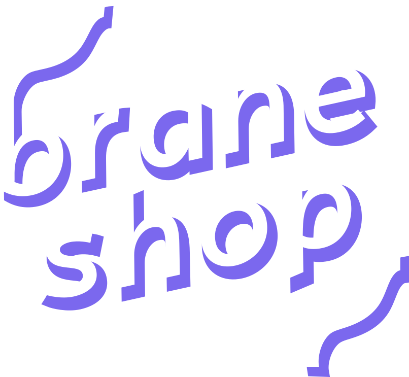
We have a new logo! You can see it loud and proud at the top of every page; but here is it again:

I like the logo because conveys “brain-ness” with the wavey lines; perhaps it reminds you of your own brain. It also feels a bit “80s” and “fun” to me; a style that I’m well-known to love, and, of course, it’s amenable to funky bright colours.
Ren is a well-rounded and wonderful designer, and I don’t just say that because she’s a friend of mine. Here are some of the reasons why:
- Collaborative: Ren communicates frequently; asks your opinion, and submits some designs for review and to guide further design.
- Diverse options: Unlike other designers I’ve worked with, each of Ren’s submitted designs was actually quite unique and distinctly different from the others. The differences are not just a slight colour changes, or lower case over upper case; each design has it’s own strong elements, story, and justifcation. I think this is a very important skill for design, that I’ve not seen many people be able to do, and Ren does it amazingly well.
- Comprehensive: Once a final design was selected, Ren provides the logo in many formats and colours, and also includes nice feature “elements” (such as the squiggle in the bottom-left of the logo) as seperate files. This allows me to include and use parts of the logo thematically through-out the website.
-
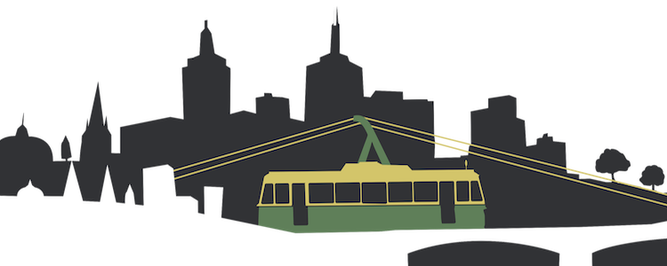
Consistency: Ren has done design work for me in the past, and it has been consistently excellent. The previous work was for Compose Conference, and the resulting logo was designed collaboratively between Ren, Lyndon and Myself, and I have to say that it’s now iconic in the functional-programming community as the “Lambda-Tram”:

So, if you’re looking for any kind of design work, definitely get in contact with her over at Ren Imagery or on LinkedIn!

